
Let’s start with a big factor Pareto figure
As a part of quality control (Quality Control), there is a “Pareto chart” as one of display methods often used.
I would like to explain what the Pareto chart looks like, how to view it, and how effective it is to use it.
What is a Pareto chart?
The Pareto chart can be expressed as shown in the figure below.
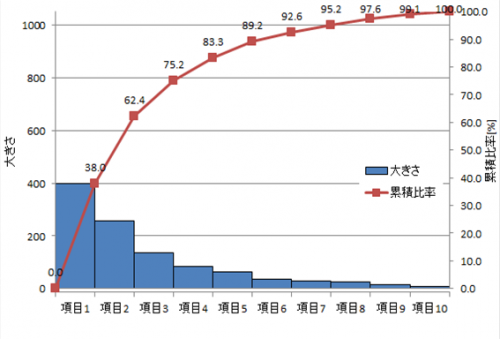
In this way, it is a graph showing the magnitude and quantity of the factor represented by the bar graph and the ratio (cumulative ratio) expressed by the bar graph by a line graph.
Rules are decided, and the bar graph is arranged in order of magnitude and quantity of factors (from left).
By doing this, you can see at a glance the overall percentage of factors.
By arranging them in descending order, it becomes a graph that is easy to see visually as to what kind of item is large proportion.
Pareto chart is easy to recognize visually
How to use Pareto chart
Pareto charts are often used for quality control (Quality Control), but there are reasons for that.
Especially, if you say what you want to do with Pareto chart, it will be as follows.
· When you do not know the priority order of countermeasures and countermeasures
· If you want to produce larger results with less measures
· When you want to give persuasive power to a factor by presentation etc.
Even if there are many kinds, even if they are sorted in descending order, the ratio can be found, so if you do not know the priority, you can say that you start with the item on the left of the graph.
Also, because you know the ratio to items, you can judge to what extent you should do as a percentage.
It is easy to understand at a glance visually, you can instantly judge the size and ratio.
It is often used in presentations and other presentations etc. to give persuasive power against “response / countermeasure details” “response / countermeasure order” “response / countermeasure result”.
Pareto charts can be used to prioritize and want to produce results efficiently
How to read the Pareto chart
I will explain the viewpoint according to the usage described earlier.
· “value · magnitude” can be known immediately from “ratio”
Or “ratio” immediately from “value · size”
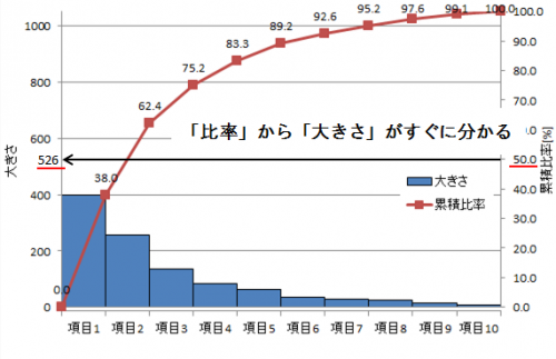
As a viewpoint of the Pareto chart, “value” and “ratio” can be known immediately.
If you draw a line from the axis of “cumulative ratio” and read the value of “magnitude”, that is the value for the ratio.
Conversely, if you draw a line from the axis of “magnitude” and read the value of “cumulative ratio”, it becomes the ratio to the value.
In this example, you can see that the size becomes “526” when the ratio is “50%”.
· “value · size” and “ratio” of summation of upper items are immediately known
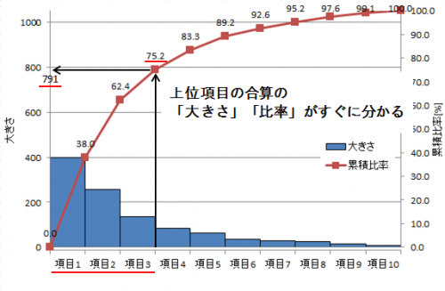
As a way of looking at the Pareto chart, you can read the “Size” value and the “Cumulative Ratio” value of the sum of the top items immediately.
Draw a line above the right side of the item of the total you want to know.
When a line is drawn from the point where the line hit the line of the cumulative ratio to the axis of “size”, the summed value of “size” becomes
If you draw a line on the axis of “cumulative ratio” you can read the “ratio” that is the sum of the top items.
In this example, we sum up the top 3 items.
The sum of the total is “791”, and the combined ratio of the three are “75.2%”.
Since there is a value on the “cumulative ratio” line here, even if you do not draw a line on the axis of “cumulative ratio”, the ratio will be that value.
· In some cases, you may notice “factor” in “size” from “common point” in upper level item
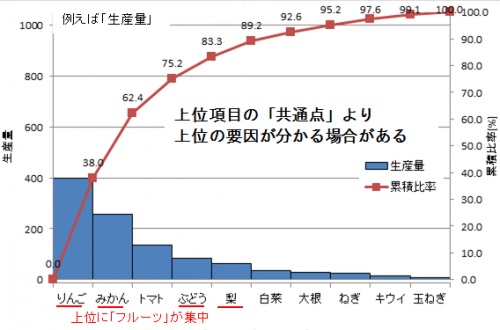
As a way of looking at the Pareto chart, if we can find out common points of the top items, it may be possible to know the factor of “size”.
In fact you may find common points and find the root cause to “size”.
In this example, 4 out of 5 top items of “apple”, “mandarin”, “grape”, “pear” have the same thing as “fruit”.
There are five fruits and five vegetables in all items (10).
However, fruits are biased towards the top.
In this case, you should think that there is a relationship of “fruit” in the top item, “size”.
If you can learn how to see the Pareto chart, you can make a decision instantly.
The following books are useful as a way to show graphs in presentations etc.
Please try it.
レポート・プレゼンに強くなるグラフの表現術 (講談社現代新書)
How to write a Pareto chart (Excel version)
It takes a bit of effort to draw a Pareto chart.
I would like to explain the method in Excel.
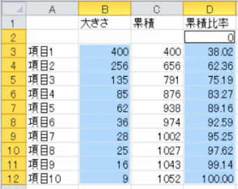
· Create a table (sort by large order of factors)
I will make a table to create a Pareto chart.
Prepare the value that you want to express in the bar graph (below, the value you want to show in the Pareto chart).
Arrange the factors in descending order.
① Specify the range you want to rearrange. (Including items)
② Select “Size” from “Home” → “Sort / Filter” → “Sort by User Setting” in the menu bar.
After this, in order to create a graph, “accumulated value” is calculated → “cumulative ratio” is obtained → “graph” is created.
Seek cumulative value
We will issue “cumulative value” for obtaining “cumulative ratio”.
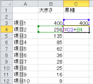
① The first of the “cumulative value” is the same as “Size”.
② From the second one we will calculate it by “previous cumulative value” + “size of the current item”.
(The cumulative value of the bottom item (last item) is the same as the total value of magnitude.)
Find cumulative ratio
We will calculate the value for making a line graph of “cumulative ratio”.
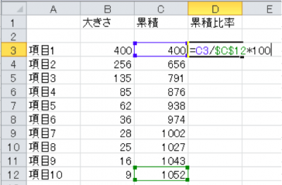
① Leave the line above the top item empty.
② Enter “0” in the cumulative ratio column there. (First value of cumulative ratio)
(You do not need to write anything in the cause.)
③ “Accumulation of items” / “Last item of accumulation” * 100 to make cumulative ratio.
(The sum of “last item of accumulation” = “size”)
The reason for putting 0 at the top is the starting position of the line graph in the Pareto chart, because we want to start the line chart of the Pareto chart from the 0 position.
The lower column divides the cumulative number by the total number and multiplies by 100. That is why I will issue the cumulative percentage [%].
“Last item cumulative” is marked with “$”, but it is a mark that prevents the value from moving when copying and pasting.
By pressing “F4”, the corresponding part is marked.
· Create bar chart (size)
Next we will create a graph.
The following is a shortcut key used in graph creation.
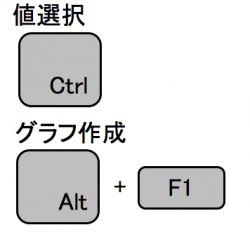
① Hold “Ctrl” and select “size” · “cumulative ratio” (including 0).
② Press “Alt” + “F1”.
(If you want to put a graph on another sheet, press only “F11”) to create a graph.
Specify the range of the graph like this. Please enter 0 for the cumulative ratio.
Of course, there is no problem even if you select a bar graph from the menu.
· Create a line chart (cumulative ratio)
Next we will change it to a line chart representing the cumulative ratio.
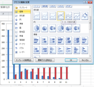
① Select the bar graph of “Cumulative ratio”, right click and select “Select graph type” → “Line chart with marker”.
② “Cumulative ratio” is changed from a bar graph to a line graph.
Add axis for line chart
I think that the vertical axis is now the size.
Next we add another axis and create the vertical axis of “cumulative ratio”.
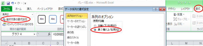
① Select a polygonal line which is a line of “cumulative ratio” on the graph
② Select “Format” of graph menu of menu (red frame on the right side of the figure)
③ Select “Format setting for selection” (red frame on the left side of the figure)
④ Check the “2nd Axis (Up / Right)” in “Series Options” in the data series format setting (red frame at the center of the figure)
I think that the vertical axis for “cumulative ratio” was created on the right side of the graph.
Changing axis changes
Adjust the scale of the axis of “size” and “ratio”. (So that you can visually decide immediately)
First, adjust the scale of the bar graph.
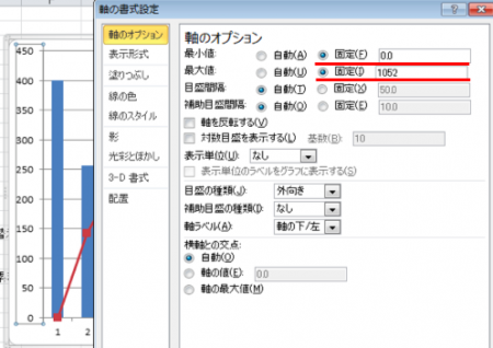
① Select the vertical axis on the left side of the graph (vertical axis of “size”).
② Right-click and select “Format Axis”.
③ Set the “minimum value” of the axis option to 0 and the “maximum value” to the total value of “size” (the last item in the cumulative column).
Similarly, adjust the scale of the line graph.
① Select the vertical axis on the right side of the graph (vertical axis of “Accumulation ratio”).
② Right-click and select “Format Axis”.
③ Set the “minimum value” of the axis option to 0 and “maximum value” to 100 (the maximum of the ratio is 100%).
Formatting the chart
· Change width of bar graph
Make the width wider and prepare to align the mark of the polygonal line with the corner of the upper right corner of the bar graph.
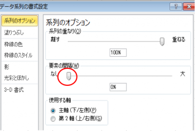
① Select the bar graph (size).
② Right click and select “Format data series”.
③ Set the interval of elements of the series option to “None”.
(If the bar graph sticks hard to see, change it to “1 to 5%”, or add a border to the bar graph.)
· Change the position of broken line mark
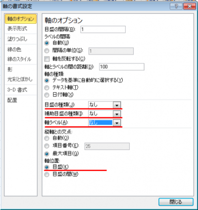
Change the axis position and align the polygonal mark with the upper right corner of the bar graph.
① Select a line graph (cumulative ratio).
② Select “Graph design” → “Axis” → “Second horizontal axis” in the graph’s graph tool menu.
③ Select “Select target format”.
④ Make the axis option “None” for “scale type”, “None” for “auxiliary graduation type”, and “none” for “axis label”.
(Center of figure)
⑤ Check the “Scale” of the axis position.
·others
Please add a value above the polygonal line marker, format the graph with the title of the figure, the name of the axis etc attached.
It takes time and effort to make once, but after creating it you can copy and use the graph.
Please try various.
If you make a type of Pareto chart, you can use it in the same way
The following books are used as a way of displaying graphs in presentations etc.
As a way of expression it will be helpful.