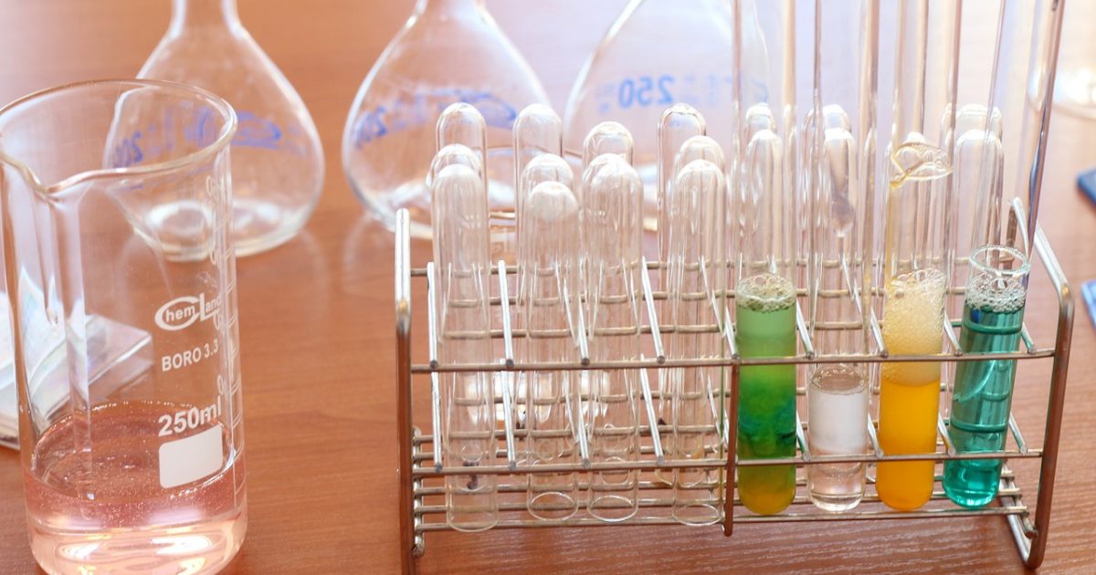
Quality barometer of product function “Function reliability” When designing products, we will make product specifications. It will be expanded from the product specification to the function of the product, but as long as the quality of the function itself can not be maintained, the specification can not be satisfied as a result. I would like […]
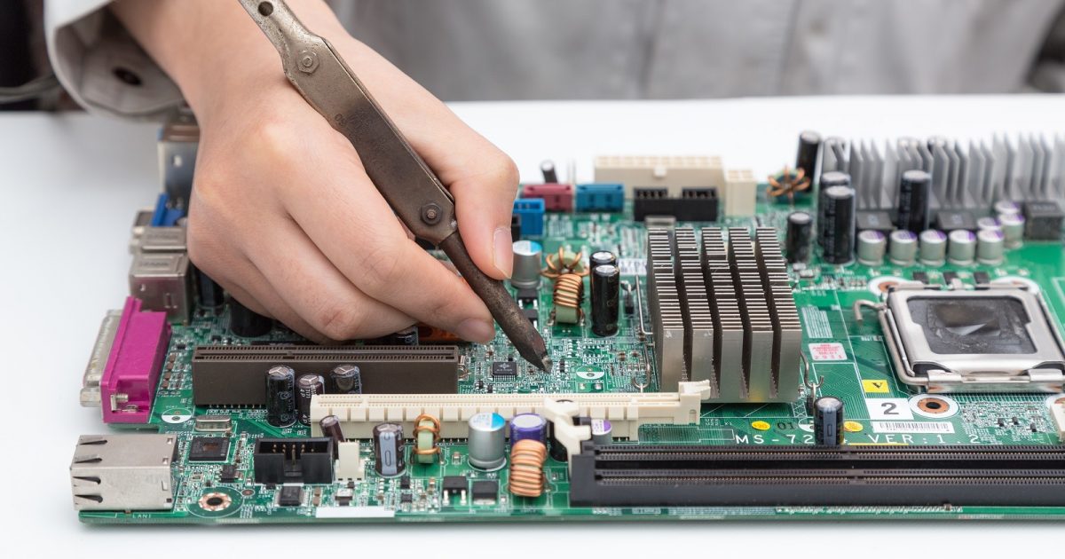
Manufacturing terms
Quality barometer of product function “Function reliability”